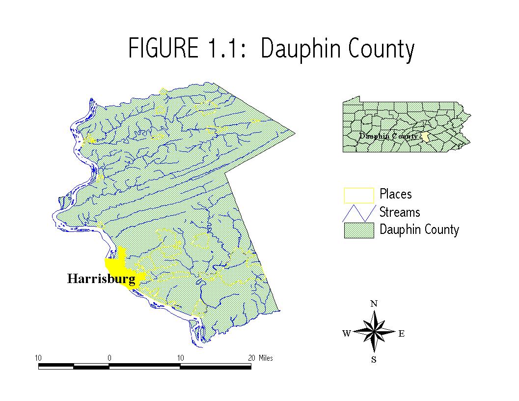
Dauphin County
and Harrisburg
fig1-1.jpg 131.94 Kb
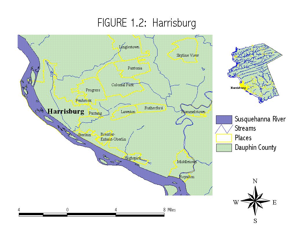
Harrisburg and
environs
fig1-2.jpg
181.34 Kb
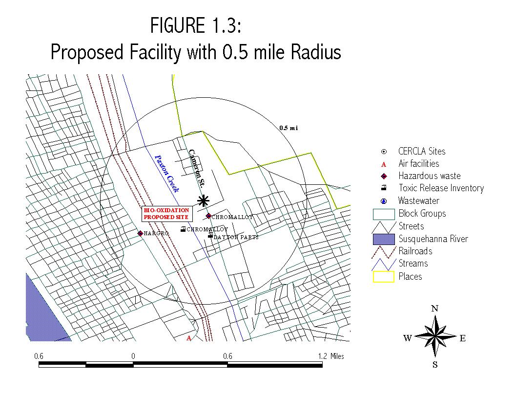
Proposed facility
.5 mile radius
fig1-3.jpg
159.61 Kb
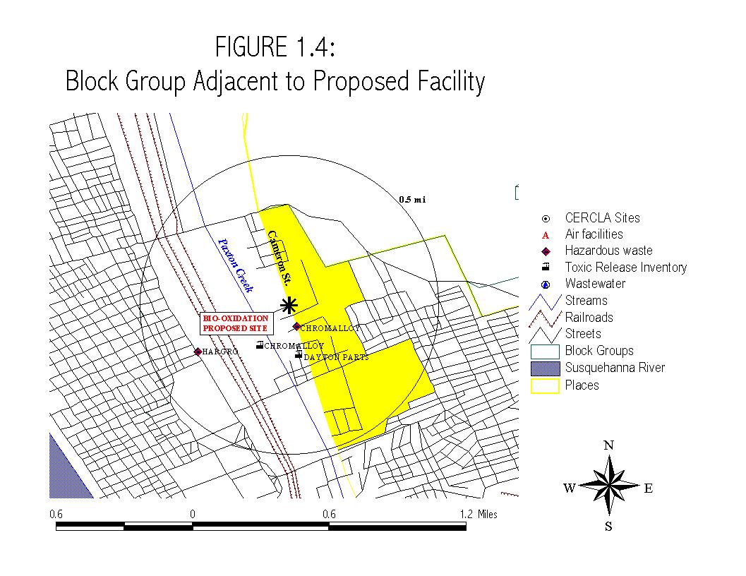
Adjacent block
group
fig1-4.JPG
153.60 Kb